Since the integration of the two websites, we have seen a significant increase in website traffic, resource downloads and the number of requested approvals. Overall, our users are more engaged with the website, and we have had some fantastic internal and external feedback.
Kate McKay
Project Lead - NCFE

Traffic increased by 63%

Homepage exits reduced from 35% to 21%

Bounce rate reduced from 51% to 27%
NCFE are a leading provider of educational services with a strong heritage in learning and have been at the forefront of technical and vocational education for over 170 years.
One of NCFE’s strategic aims is ‘leading digital disruption in education’. We have been working in collaboration with NCFE since 2011 on realising this ambition.
Migrating the Qualhub platform into the main NCFE site included:
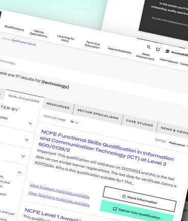
- Search functionality - allowing users to search for qualifications
- Qualification resources – enabling users to find and download associated qualification resources
- Educational centres approvals – processing education centres to become approved to teach qualifications
Phase 1
The challenge
On paper, this project might sound like a straightforward lift-and-shift operation.
However, project scope also inclided added functionality, updates to the UI and UX, and, importantly, migration to a newer version of Umbraco.
Project scale was also a key consideration, with the QualHub site comprising 1600+ qualifications/unit items, 1000+ resources and 6000+ pages.

Phase 2
The approach
Phased approach to realise value of investment early
Our approach was to break the user journeys down into three key pieces of functionality. Each would be completed and delivered as it's own phase, so users got early access to improvements in user experience.
- Search – allowing users to search for qualifications
- Resources – enabling users to access associated qualification resources
- Approvals – allowing education centres to become approved to teach qualifications

Designing for dependencies
A key piece of planning was required in the phase between Search, and Resources and Approvals.
Once the Search phase was delivered, we then needed to ensure that search functionality on the new site navigated users seamlessly to the QualHub where the user journey would continue.
Custom UI for a smooth experience
A custom Umbraco solution was created to craft a qualification basket / approval journey focussed on letting users complete activities effectively.
Integration with various external resource systems let NCFE provide an intuitive front end experience, without needing to change the underlying data sources.
Advanced search and filtering let users get the most from the underlying information.
Personalised Journeys
Using Umbraco's personalisation toolkit, we created personalised journeys.
Improved UX & Accessibility
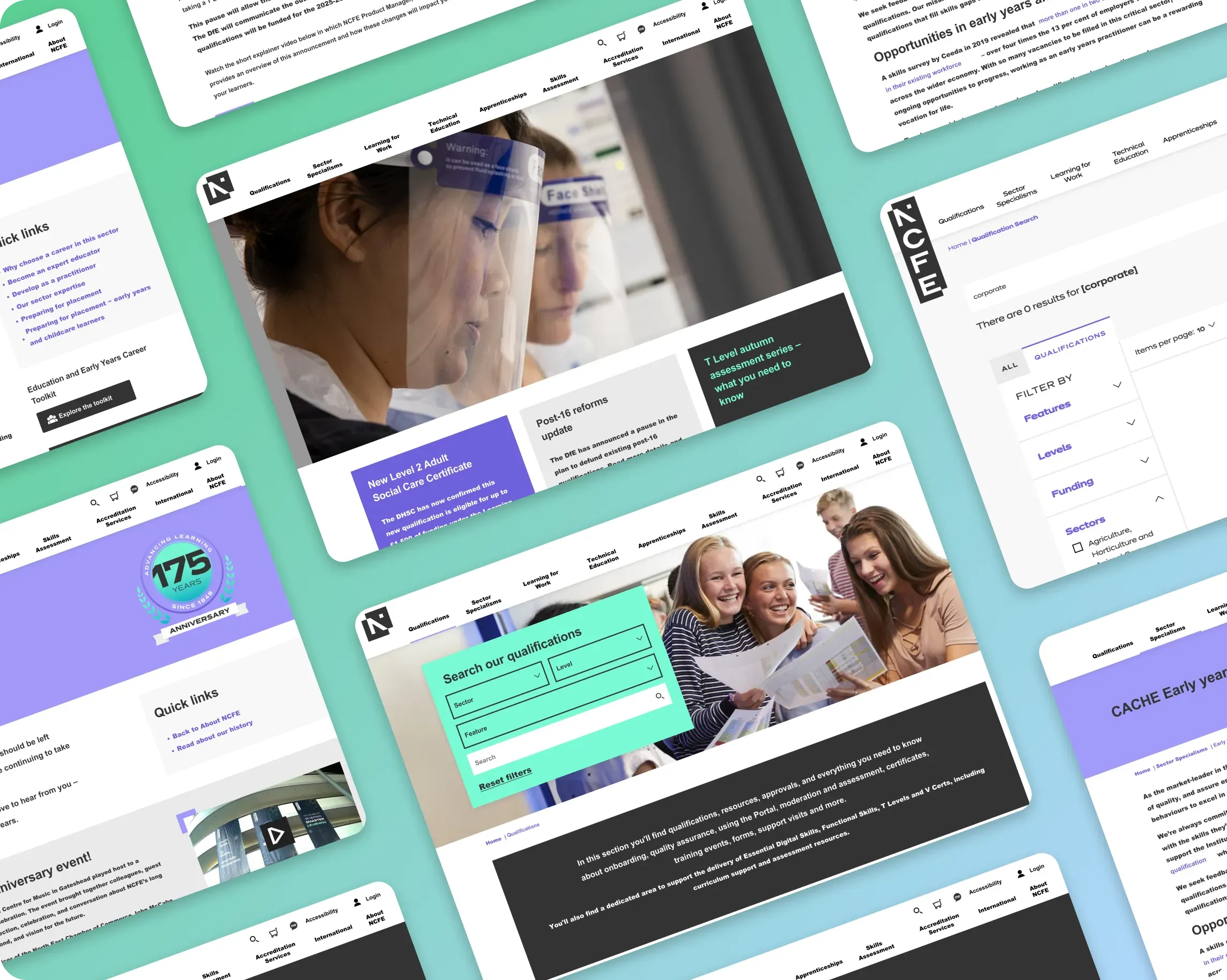
Design-wise, site-wide improvements to the UX and UI were also undertaken, putting accessibility at the forefront.
Intuitive navigation, responsive design, clear and engaging content, fast loading speed, and streamlined forms and processes brought the experience to a high standard.

Phase 3
The outcome
Following migration, the main NCFE website now offers a single, unified place to service the needs of their users.
Processes are streamlined, and improvements to the UI has allowed for accessible, intuitive and frictionless user journeys, while new search functionality allows customers to find what they’re looking for with ease.
Within the first few weeks from launch, the NCFE team were able to observe increased user engagement in their analytics data.
Looking to achieve something similar?
Book a call with our team to discuss how we can help.
Related content

NCFE
Revisualising the user experience to transform learner journeys and help NCFE build valuable insight.

ICO
Empowering citizens to self-serve their information needs through a powerful Umbraco web ecosystem.

Northumbria University
Helping Northumbria University realise their vision for a transformed web ecosystem and student experience.


